OG share cards v2 — three new directions. "More fun" redesign. Asterism-forward, typography play, and show-the-work. Right-click any card, Inspect, and screenshot the .og-card element at 1200x630 to export.

Concept 1: Asterism

Jess Dale
jessdale.com

Dark, minimal, symbol-first. The asterism is the brand. No tagline, no explanation. Pops in light social feeds. Curiosity-driven — makes you want to click.

Concept 2: Typography Play

Jess Dale
design, systems, & the work underneath
jessdale.com

Editorial feel. Three type families in conversation: Lora (authority), Crimson Pro italic (warmth), JetBrains Mono (precision). The ampersand in accent color as a subtle brand touch. Light bg for feeds that are already dark.

Concept 3: Show the Work

Ceramic vase on potter's wheel
Jess Dale
Design leader, builder, maker of things.
jessdale.com

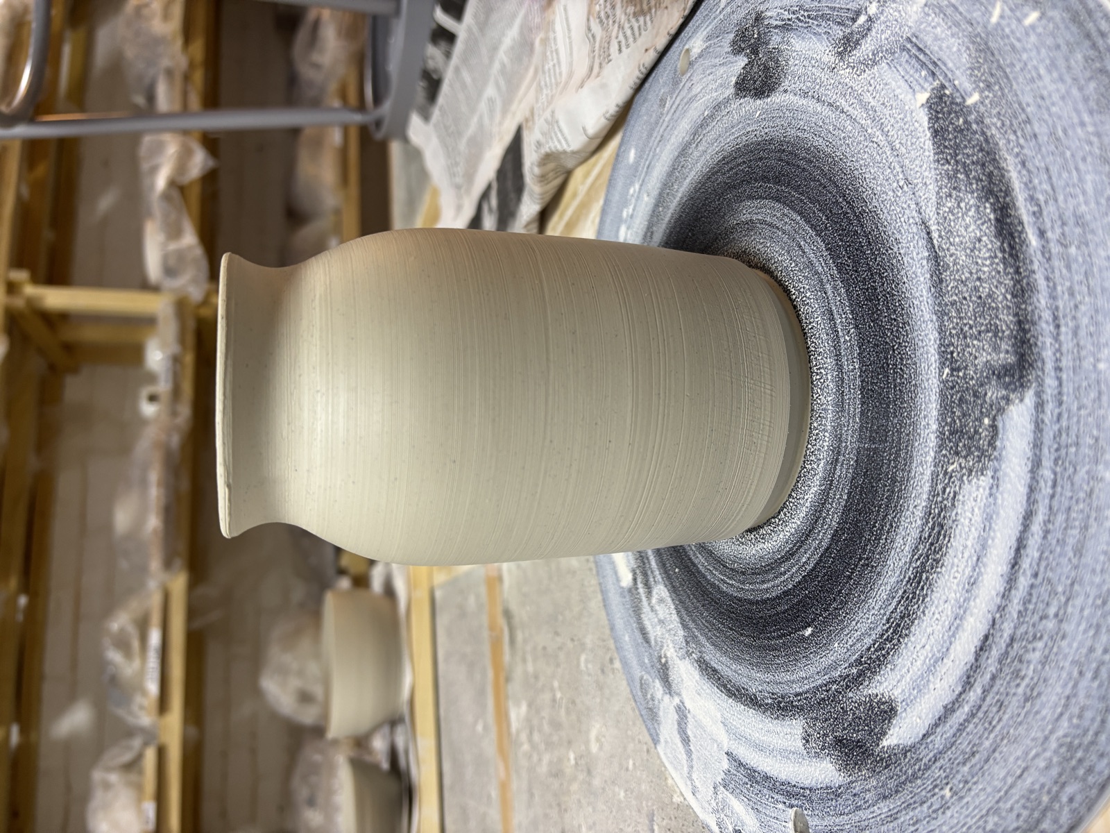
Real photo, real work. The ceramics image says "this person makes things with their hands" before you read a word. Gradient overlay keeps text legible. The asterism anchors the brand in the corner. Most personal of the three.