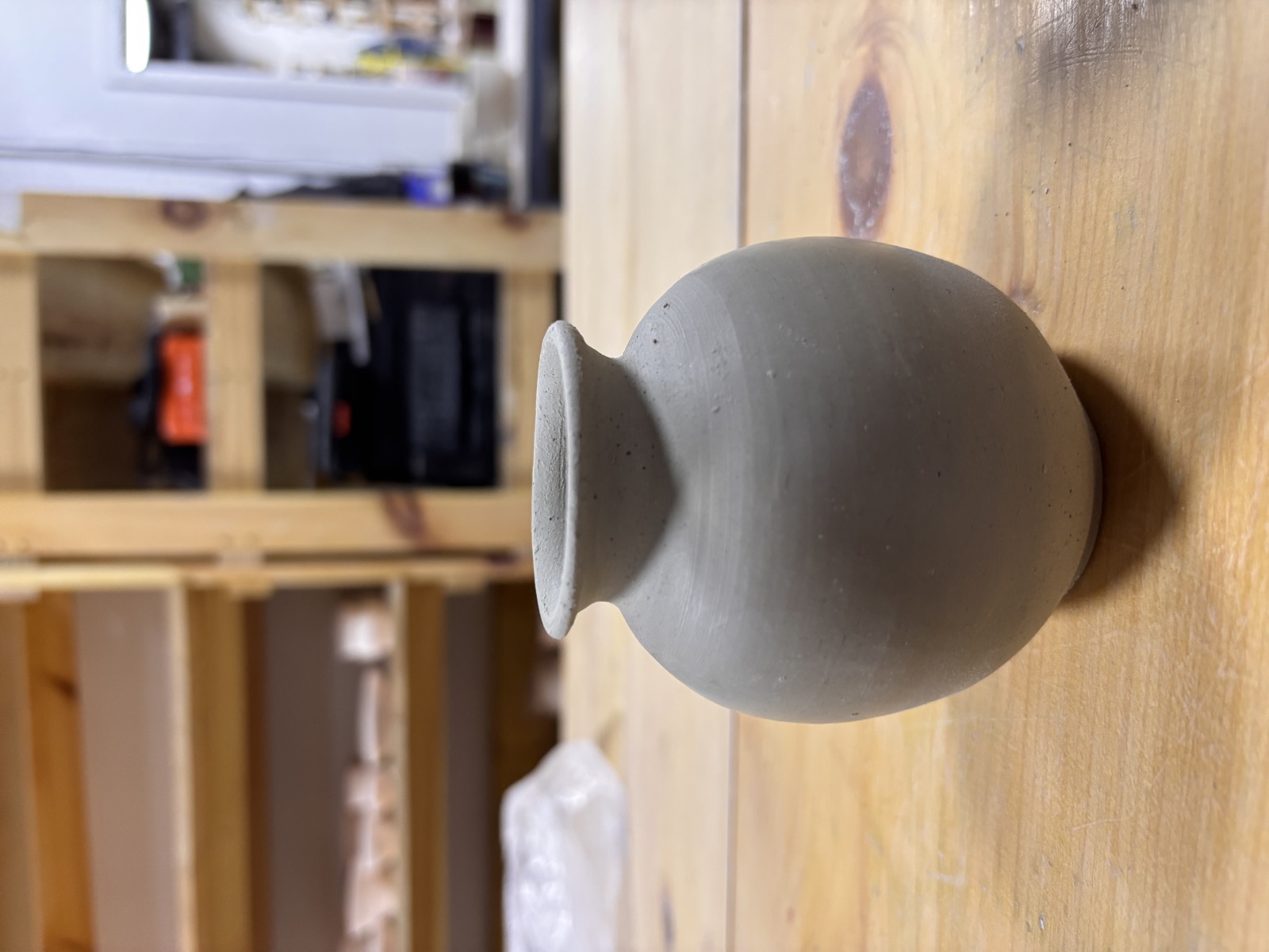
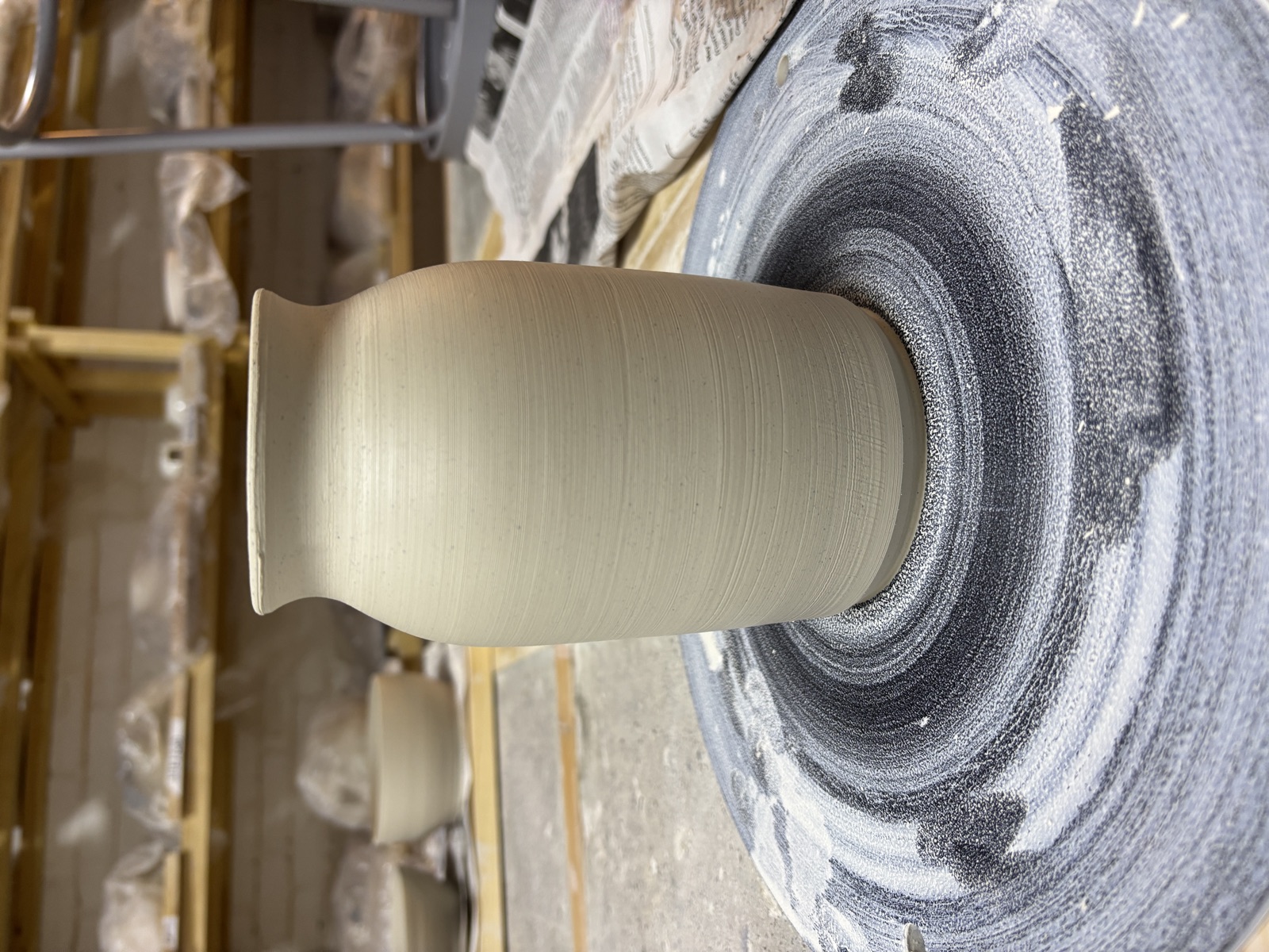
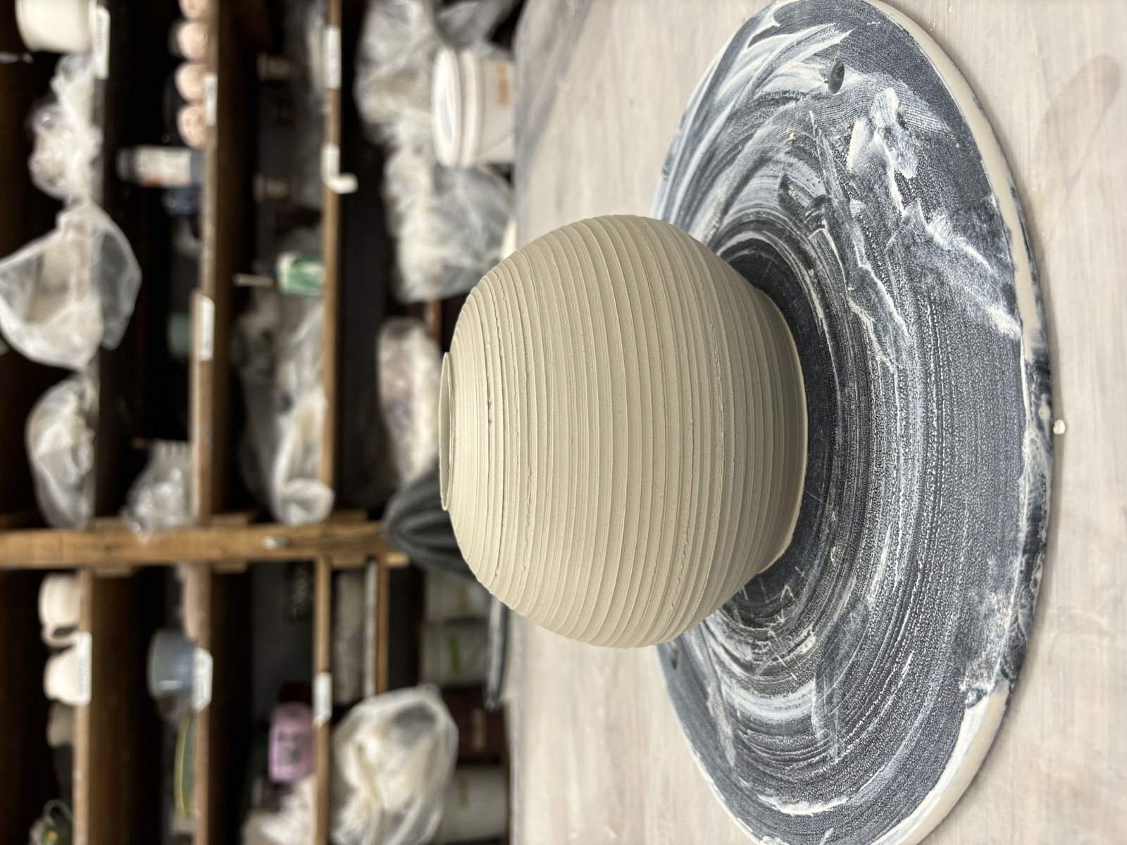
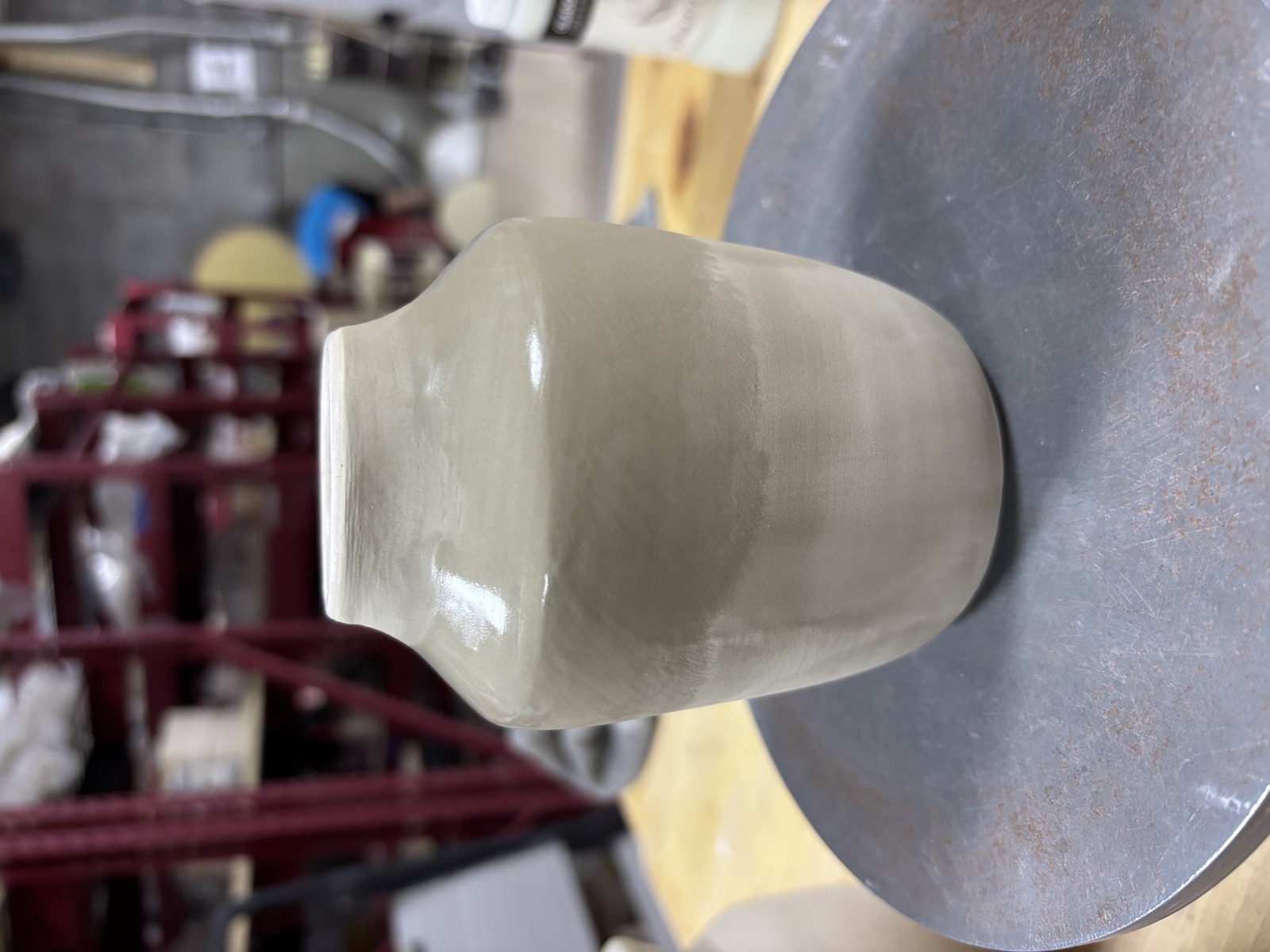
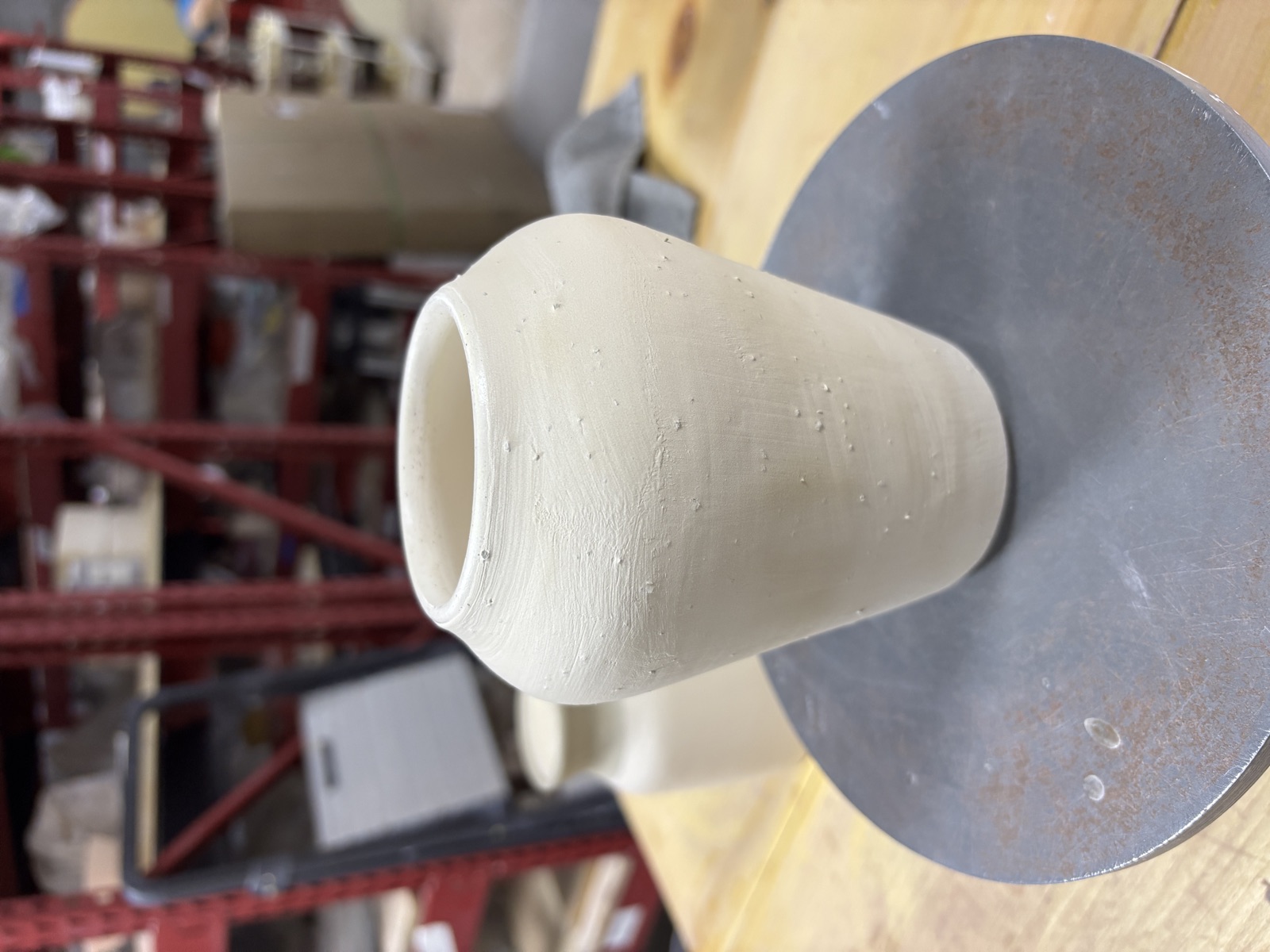
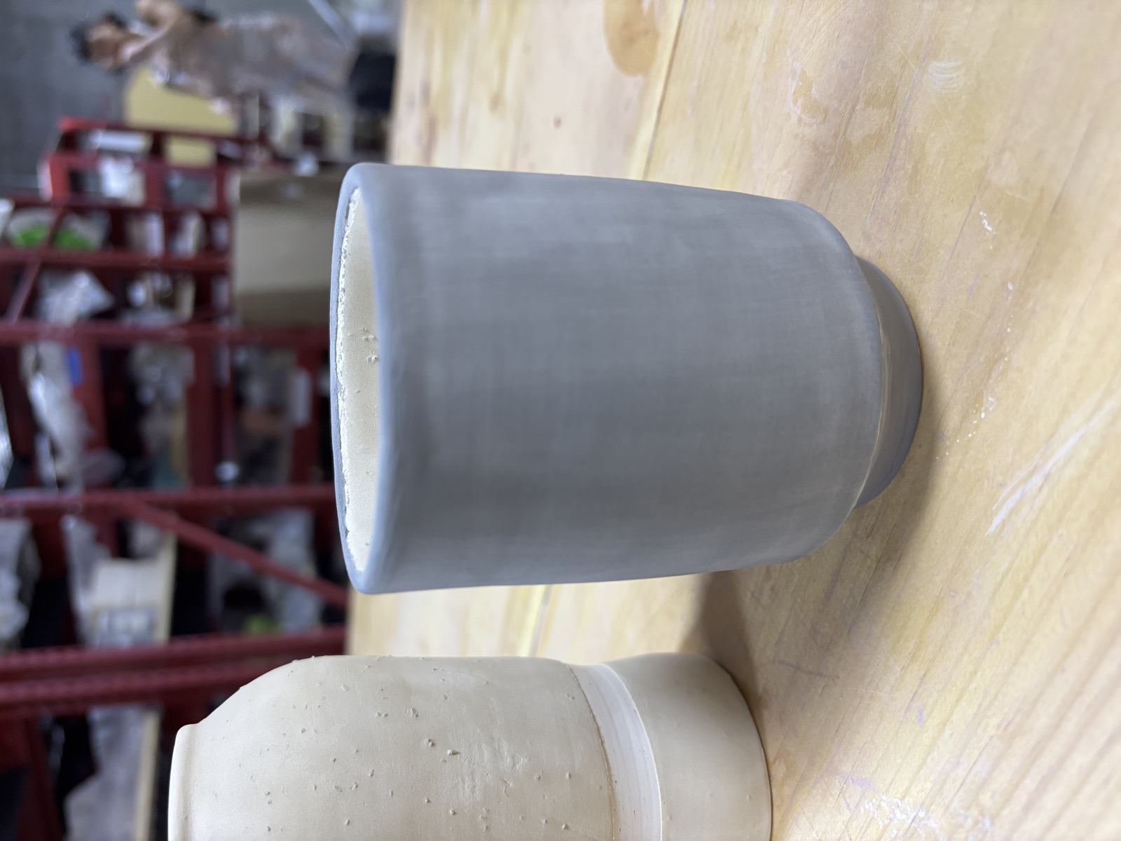
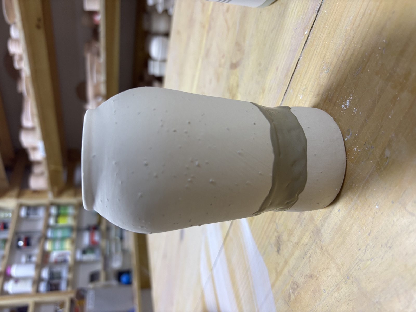
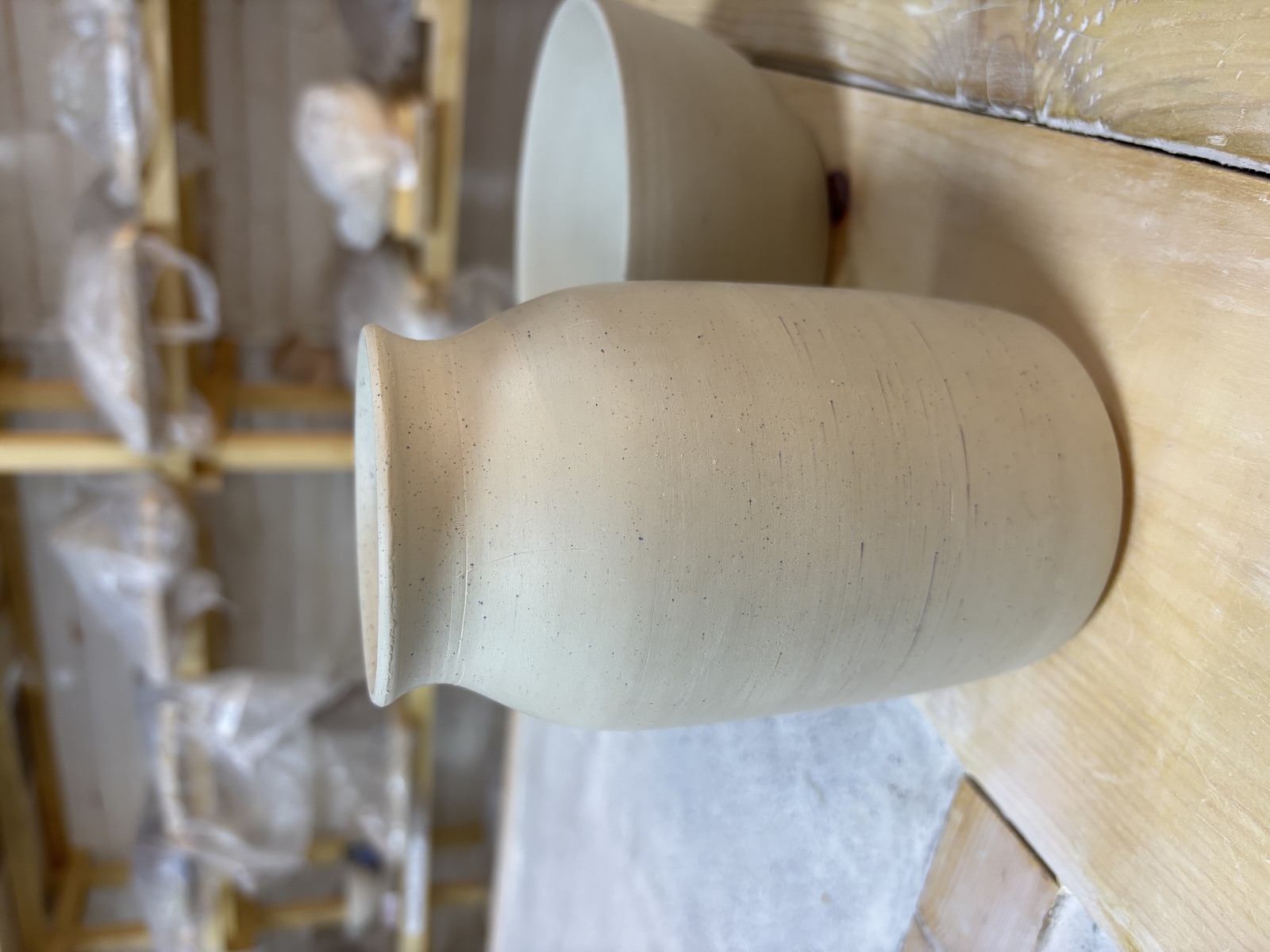
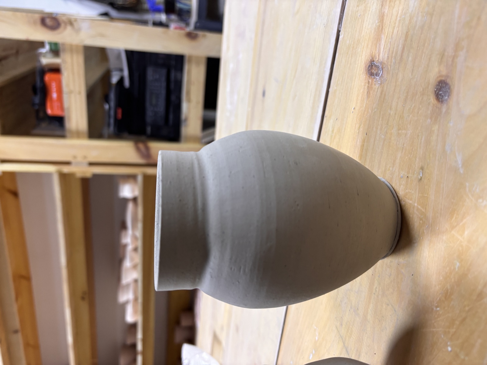
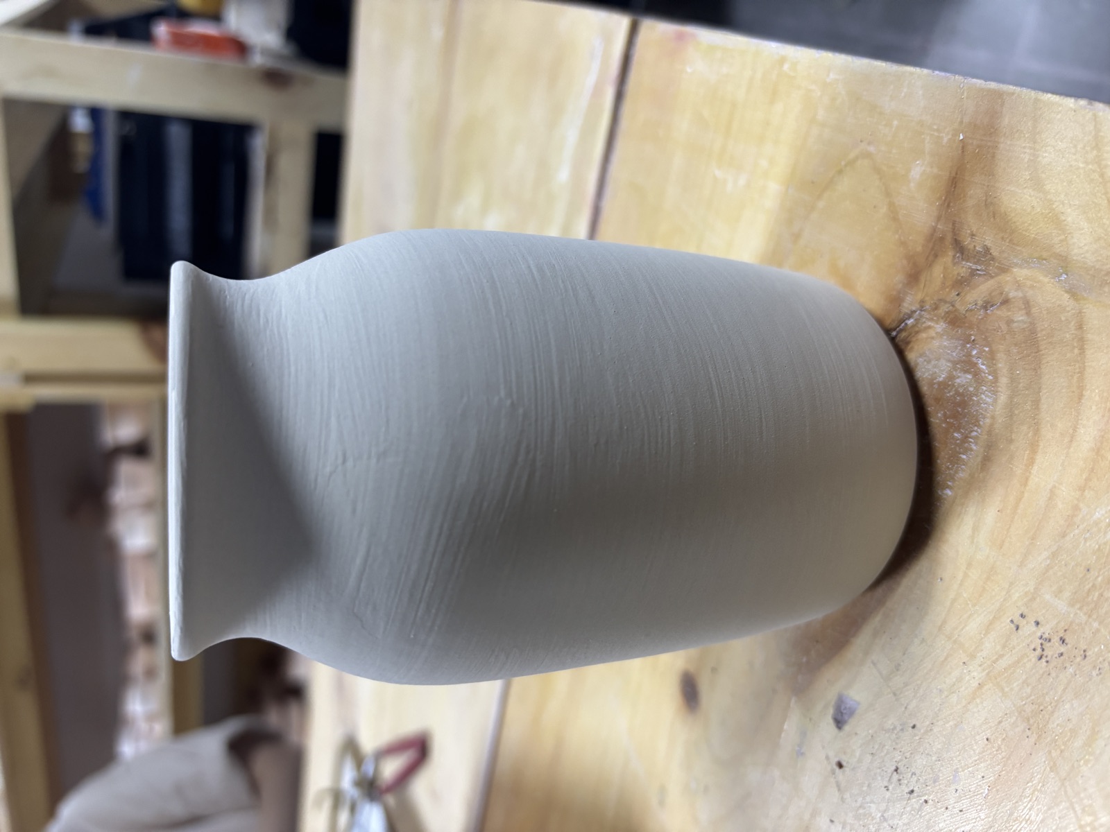
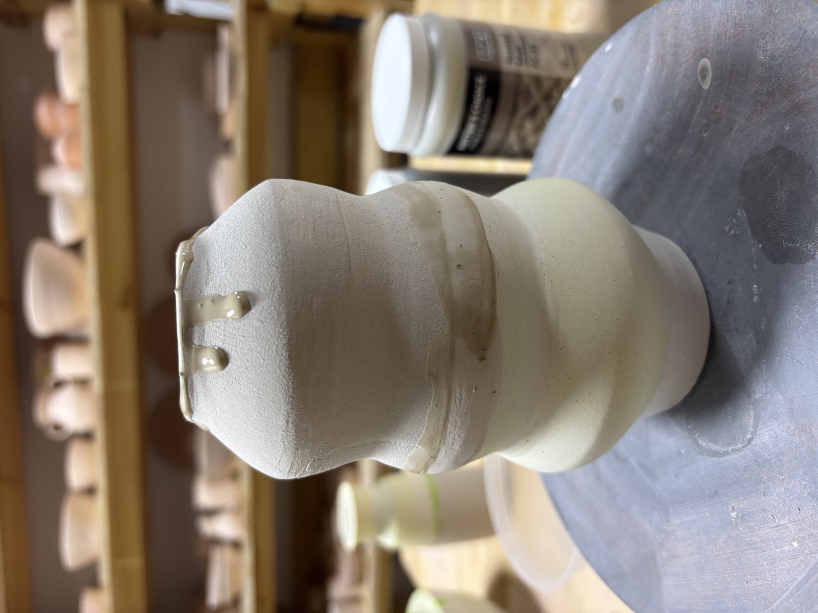
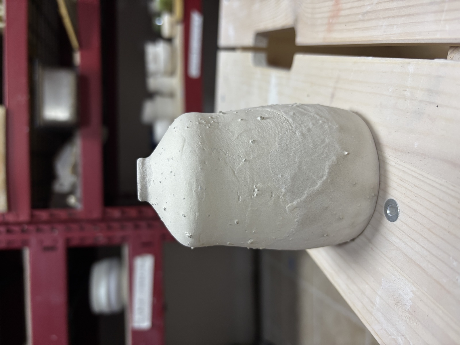
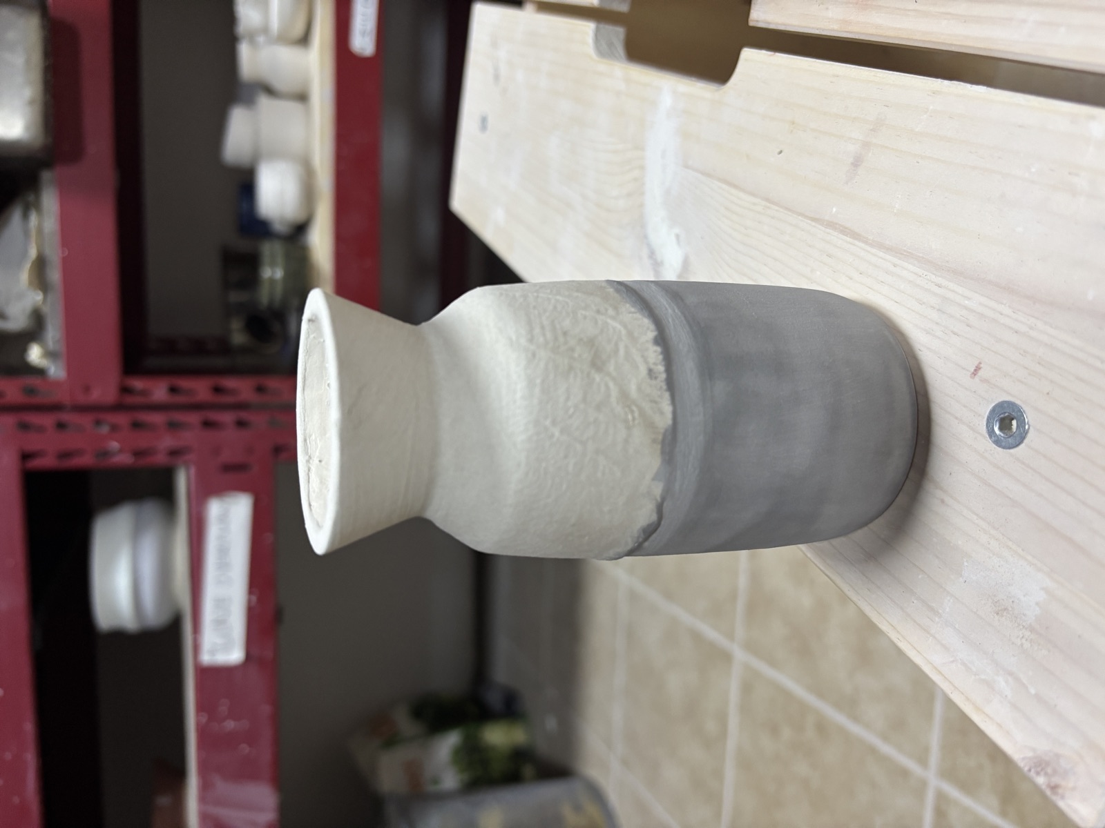
Handmade pieces by Jess. Thrown, trimmed, glazed, sometimes cracked. Each one a small argument with clay.
A gallery that feels like handling the pieces, not browsing a catalog. The asymmetric grid gives each photo a different weight and rhythm, the way a shelf of ceramics is never perfectly even. Some pieces get room to breathe. Others cluster together.
The essay layout's palette already exists for exactly this kind of content: physical, earthy, handmade. Using it here connects the gallery to the rest of the site's editorial voice without forcing it into the main site's blue-cream scheme. Clay objects deserve clay colors.
Twelve columns with five piece sizes (hero, side, medium, small, wide, third). The variety means no two rows repeat the same pattern. The dinkus breaks the gallery into two movements. I wanted it to feel curated rather than generated, like someone arranged these on a wall and stepped back.
The photos are raw studio shots, unoptimized. They need compression before this ships. I'd also like to try slight random rotation on the pieces (Helen Levi's site does this well) and richer captions that include the clay body or firing stage. Maybe a horizontal scroll variant for a different kind of browsing.